
How to Add a New Page to the WordPress Navigation Menu
How to Add a New Page to A WordPress Navigation Menu
In this video, I walk you through the process for adding a new page to your WordPress navigation menu.
Before We Talk WordPress Navigation Menus, a Note on Re-Branding
Before I dive into this demo on adding pages to your navigation menu items, I wanted to mention the fact that I am in the process of re-branding, which is super-exciting! Originally, all my projects were under the “KEM Biz in a Box” umbrella. But I’ve since changed the name of my Facebook group. The reason for this is so that it’s more visible when people are searching for the areas that we cover in the Facebook group. The group name has changed from “KEM WordPress Community” to “The Entrepreneurs Marketing & WordPress Community with Sharon Henderson”.
It may not be quite so succinct – and indeed, one might go so far as to say it’s a bit of a mouthful! But it’s necessary to enable people to find the group when searching for “entrepreneurs”, “marketing” and “WordPress”. For now, I’ve left the URL the same though. So, it’s still in groups under “KEMWordPressCommunity”. That’s so that people who are already members of the group can still find us. Broken links are never a good thing!
A Wider Re-Branding Strategy
This is all part of a wider rebranding strategy that I’m in the process of implementing. I have lots of projects on the go, and they were all under the “KEM Biz in a Box” umbrella. That was getting a little confusing because not all the projects actually related to KEM.
So, I have rebranded as myself – Sharon Henderson – because I’m the one that creates the content, does the lives and hosts my podcast – “The Kiwi Mompreneur Show”. I’m also in the process of creating a new website, as well as re-aligning all my social media platforms under my own personal umbrella. So, that’s what’s been going on behind the scenes. And if you just search for “Sharon Henderson” or “sharonxhenderson” on any of the social media platforms you should find me. And my new website domain (as you’ve probably already figured if you’re consuming this content on my blog!) is sharonxhenderson.com.
Okay, So What’s the “x” in “sharonxhenderson” All About?!
The “x” has a wee bit of a story behind it. My parents didn’t give me a middle name for whatever reason. This meant that whenever employers had to set me up with a new staff login, they always put an “X” instead of my middle name! Over the years I’ve become quite attached to that little “x” and have adopted it as my own initial! As you can see, there really is some method behind my apparent madness!
My courses put the power in your hands. Not only do they teach you how to build your site, but how to maintain it afterwards. And all you’re paying for this is essentially your hosting fee. Which you would have to pay anyway!
I will be going live again same time next week. As always, if you have any special requests – anything you would like me to do a live on, then do let me know.
The Demo: How to Add a New Page to A WordPress Navigation Menu
Okay, time to focus on the purpose of this video. For the demo visuals, check out the video above.
For the purpose of the demonstration, I am using one of my WordPress Starter Websites. These are the sites that Challenge participants receive when they do the 30 Day WordPress Website Challenge. At the time of writing, they also receive a free site for the 5 Day Mini Challenge. If this is something that’s of interest to you, you can read more about it here:
The Demo site I’m using for the purposes of this demonstration has what we commonly refer to as a “hamburger” style navigation menu. You typically see this style of menu on a mobile device. In the video, I go ahead and change this to a standard desktop menu.

Switching to the Back End View
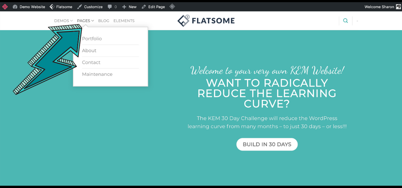
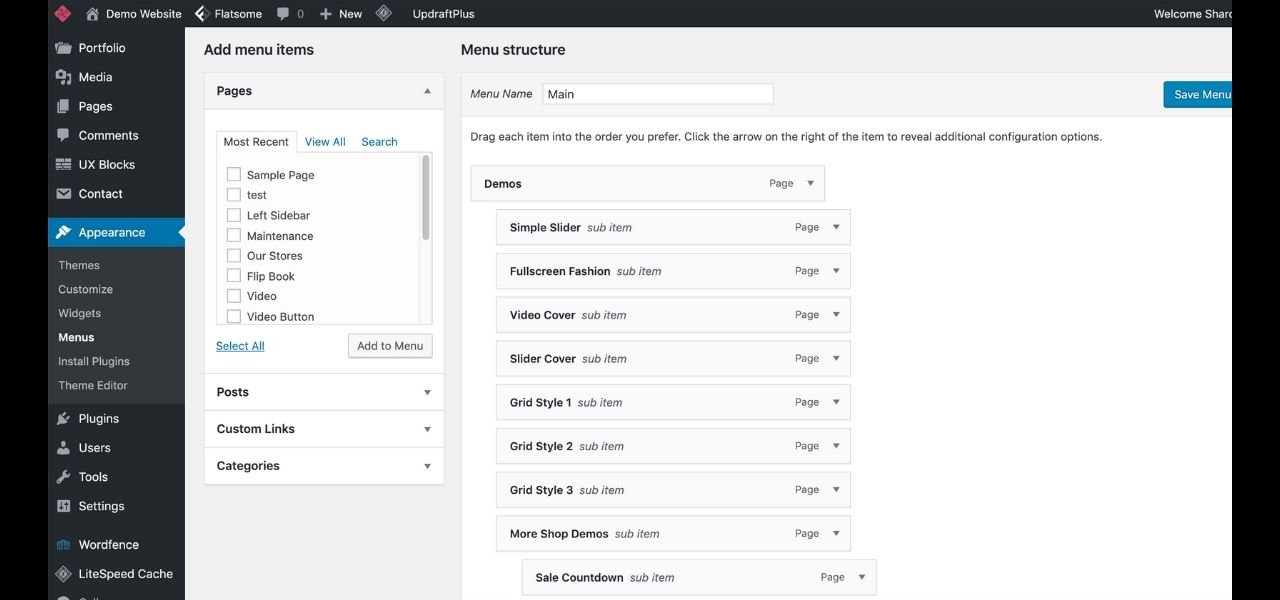
You can customise your website from the front end or the back end. At this point in the video, I switch to the back end. What’s clear, is that there are a lot of navigation menu items currently displayed here. I have the option to choose from lots of different menus and menu locations.
In the demonstration, you can see that there are lots of demo items displayed in the navigation menu. There are shop demos, business demos, shopping pages and much more besides. You can also see that there is a hierarchy to the menu items. On the front end, there are the main menu items. When you go ahead and click on them, they open up many sub-menu items in a dropdown menu. You can tell which items have sub-menus by virtue of the little down arrow that is displayed next to it. Below is a screenshot showing the dropdown menu arrow and the sub-menu items displayed when we click on it.
Live Customization Feature
There is an option to make the changes via the front end live customization feature. I love this feature, because it enables you to see exactly what you’re doing in real time. I’m using the Flatsome Page Builder with this demo site. Flatsome has a neat feature, called the “Header Builder” which you can see in the video. Let’s go into the Header Builder. I can simply click on the mobile menu and drag that off the header, and replace it with the standard traditional menu instead. In the diagram below, you can see the header builder. This opens up once we access the Header Customization options in the Live Customizer.
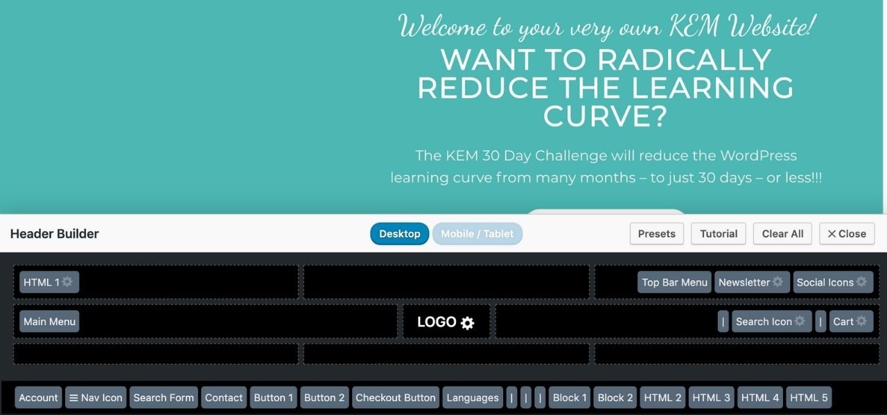
Now Flatsome is a Page Builder. Contrast this with a simple theme – or template. Flatsome gives you a lot more flexibility when it comes to customising the layout of your website. It’s important to hit “publish” after making edits, so that they are saved. Next, I will go into the navigation menu.
In the video, you can see that on the back end, the main navigation items are aligned at the very left hand side. There are five of them. We have the demos; then we have the shop pages, and then the blogging elements. So, those are the main (top level) menus items in our hierarchy.
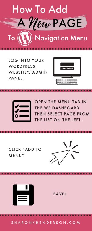
How to Add a New Page to the Navigation Menu.
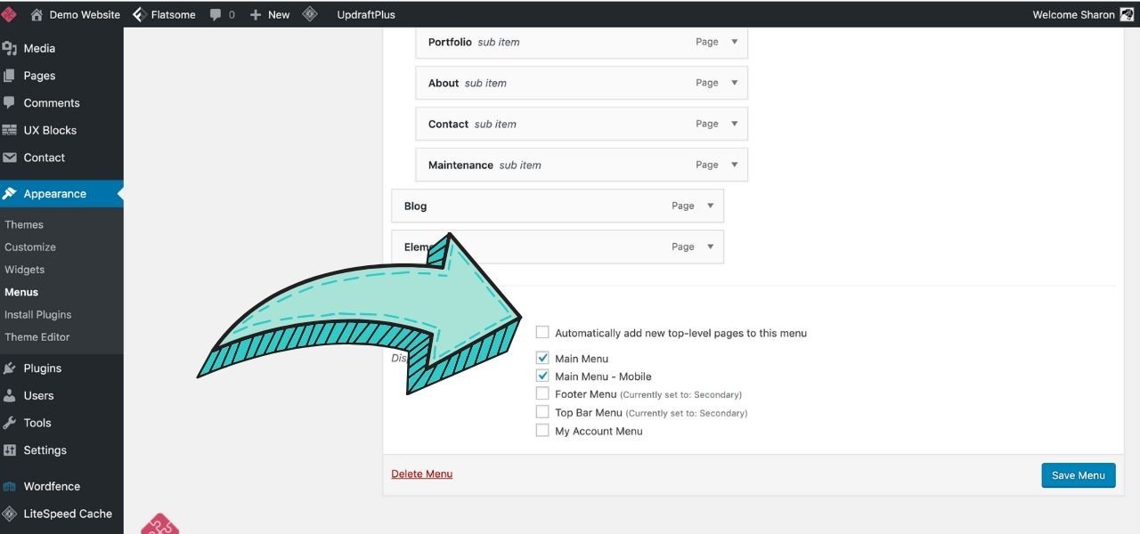
To add a new page to the Navigation Menu is pretty simple. All we have to do is go to our most recent pages. In the video, I demonstrate where you can view a list of recent pages. I can then click “Add to menu”. That selected recent page is added to the bottom of the list of menu items. I have reproduced this in the screenshot below.
If I want that page to be a submenu, I just have to drag it inwards to the right. That transforms it from a top level item, to a sub-menu item. I can also take an item anywhere. All I need to do is simply click and drag that item wherever I want it to go.
Option to Automatically Add Top-Level Pages to Menu
There’s also the option to automatically add all your top-level menu items to your menu. You can cimply check the “automatically add top-level items” check-box. This is shown in the screenshot below. But, personally, I’m not a fan of doing this. That’s because new pages are always automatically added to the bottom of the menu item list – in real time. And, oftentimes, this is simply not desirable.
Editing Your Website: Best Practice – Use a Staging Site
When making edits to a live site, it is always advisable to do it in the following way. For the purposes of this demonstration, I am essentially editing a live site. And I strongly recommend you avoid doing this for sites that are operational and receiving visitors. The safe and most professional way to make edits to a live site, is to first create a staging site. This is a duplicate copy of your website, where you can test your edits. When you’re ready, you can then push them through to the live site, confident that they will have the desired effect.
Maintenance Plugin Option
Not all hosting companies offer staging site functionality. However, my web hosting services do include this feature. If your host doesn’t offer staging sites, then I would recommend installing a maintenance plugin. Alternatively, you can switch over to a maintenance page. Then visitors will see a message on the front end to the effect that the site is currently undergoing routine maintenance. Typically, you can customise the maintenance page and include your own branding too. This is a far better alternative to live editing. That’s because live editing has the potential to bring down your site. Or it could reduce the front end view to a page full of code and misaligned pages. Or, heaven forbid, the dreaded “white screen of death!”
Why are There So Many Menu Items?
In the video, this demo site has a long list of menu items. If you’re wondering why this is, then the answer is simple. It’s because all Flatsome sites come pre-loaded with a huge library of templates that you can choose from. The same is true for the Starter Websites that Challenge participants receive when they sign up for the Challenge or the Mini-Challenge. The result is that the building process is significantly reduced!
So, for example, let’s say that you’re creating a really basic agency site, you won’t want most of the templates. In this case, you can easily delete these items. Simply click on the button to open up your options and select “remove”. Gone.
Similarly, if I don’t want any of my shop pages, I can remove these too. And the menu hierarchy remains intact. Even though the menu items are removed, the pages themselves remain intact. They can be found under “pages” in your dashboard/admin panel. Always remember to hit “save!”
Menu Locations
The Navigation Menu you see displayed in the screenshot from the video (below) in the existing Main Header is currently set to “Main Menu”. You have the option to choose where you want this particular menu to be displayed. There is the option to also display the existing Main Header menu in the mobile header too. That said, if it’s a menu containing many items, a shortened version might be necessary for display on mobile. Meaning that it’s often preferable to have a different menu displayed on mobile and desktop.
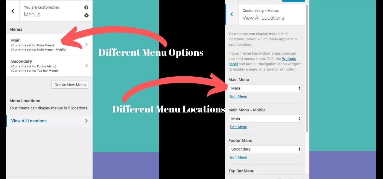
In the video, you can see the template that the footer menu uses now is different to what you have in the Main Header. You also have the ability to display more than one footer menu. Currently, we have our footer menu, which is currently set to the secondary menu. There is also the ability to display a top bar menu. However, none is currently set to display in the demo site we see on the video.
If I wish, I can create new menus and place them in different locations. With Flatsome, there is the ability to display a wide variety of different menus in many different locations. For example, I can have a “my account” menu, or I can set up a new menu for each location.
Making Pages Responsive
During the live, one of the viewers asked whether all pages are already responsive for all devices. Flatsome gives you the capability to customize according to the viewport the site is being viewed on. Depending on the layouts you use, it may be necessary to tweak your design so that it is responsive across the full range of devices. Flatsome makes this very easy to accomplish. In the video, I demonstrate how to make a demo page responsive, by selecting a pre-existing page. We take a look at the page on the front end first.
The Flatsome UX Builder
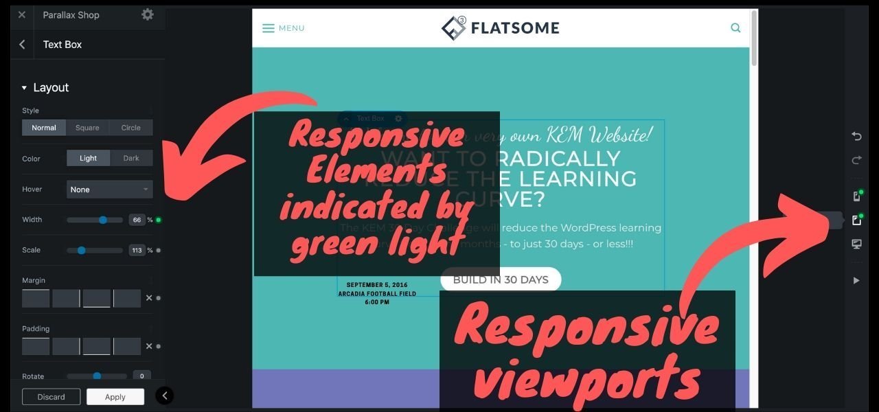
Flatsome has a UX builder which enables us to build some really cool stuff from scratch. Or, if we want, we can use templates. We first take a look at a standard page on the front end. Then I show you in the video how the UX Builder enables you to view the page layout through three viewports. These are: Desktop, Tablet and Mobile views, respectively. These options are available on the right-hand side of the UX Builder.
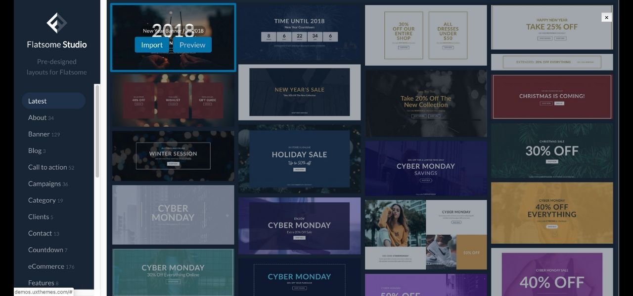
Generally speaking, if you use one of the templates from the Flatsome Studio, it should already be responsive across the full range of devices. In the screenshot below, you can see the Flatsome Studio. It’s packed to the brim with different templates, organised into convenient categories. You can mix and match layouts as required. This is the best way to reduce the work required to make your website responsive across all three viewports.
Preview Layouts
You can preview your layouts by clicking the “preview” button. And, if you like a particular template, you can go back to the original tab and click the “import’ button to import it. Oftentimes, the demo images are imported also. In the video, I select a template that includes three Icon Boxes. The images in this template are imported also. As with menu items, Flatsome Studio templates are automatically imported at the bottom of the page. Icon boxes are one of those elements that are the exception to the responsiveness rule! By this, I mean that they are not automatically responsive when viewed on mobile. So it will be necessary to do some tweaking to make them so.
Now, if I want to make an element responsive on a particular viewport, I need to have a look and see whether it’s a responsive element or not. Most elements are responsive. So, if I open up the element’s options, and I go into text > column > row, you can see the navigation menu hierarchy. In the video, I select the tablet view on the right-hand side of the UX Builder. We can see that it’s necessary to make adjustments so that it’s responsive in this viewport. We can tell if an element has responsive functionality or not because it has a green button displayed next to it. Adjustments made in tablet view only apply to this viewport. The desktop and mobile views remain unaffected.
Should you Build First on Desktop, Tablet or Mobile?
Personally, I build websites on desktop first – unless a client’s target market is mobile users first and foremost. In this case, I would build my site for mobile first, and then make it responsive on the other viewports secondarily.
The 30 Day WordPress Challenge
As I’ve already mentioned, when you get one of my free WordPress Starter Websites as a Challenge participant, your site will look like the one I have featured as the demo in the video. Each Starter Website Ships with the Premium Flatsome theme. As you’ve witnessed for yourself in today’s demonstration, Flatsome basically enables you to do anything that you like. In the video, there’s a banner displayed which repeats the link where you can sign up for the Challenge.
Seeking Additional Beta Testers!
I am currently looking for some more Beta Testers. I have a few already, but am looking for a few more. These foundation Challenge members will be given the opportunity to avail themselves of the free site. They also get access to the free mini five day challenge. This basically takes you through the setup of your site. Everything in that package is completely free – all I ask at this stage is that I get feedback from you as you go through the process and provide feedback. Tell me what’s working, what’s not, and what you would like more information on. Once I have enough beta testers I’ll set up a Facebook Mastermind Group. Here, I’ll do weekly Q&A live sessions so that I can answer all your questions.
Cloud Hosting
There’s also the option to purchase the full 30-day challenge. And it’s seriously at a crazy price right now at just $97. Given everything that you get – which is lifetime access to the full Challenge, and all future updates and resources – that’s a pretty amazing opportunity!
If you don’t decide to take the challenge, then what I do ask is that you commit to the five-day course. Plus, I require you to commit to taking over the hosting afterwards. My Cloud-based hosting plans are at a crazy crazy cheap price of only $9.97 a month. Anyone who has had website hosting in the past will appreciate just how amazing this price is. Particularly when you consider the fact that I’m talking CLOUD-based hosting here and not the far inferior shared hosting plans! Unlike your shared hosting plans, cloud hosting is super super fast and super super secure. What’s more, the price you pay won’t be inflated when you come to renew. Contrast this with the likes of Siteground. Their shared hosting plans seem really cheap when you sign up. But you’ll get a shock when you come to renew your plan, and discover that they hike their prices by a whopping 40%!
Cloud -v- Shared Hosting Plans
My cloud hosting plans are comparable in price with those shared plans. It really is a crazy crazy great deal and it won’t be around forever. Once I’ve got all my beta testers sorted, then the price is going to be going up significantly. So, I would be getting in while you can. If you were to pay for one of these websites to be built for you, you’re looking at thousands of dollars! And the other thing to consider, is that when you pay for a developer to build you a website, you don’t have the ability to maintain it or update the content and images. This is a common source of frustration for people. People pay a lot of money for a site to be built, and they then find that they have to pay extra every time they need to make changes or run into issues with the site.
Thank you for tuning into this live. I hope you have found it helptul. If you have any questions, please leave a comment below and I will be happy to answer them.